The Trump Administration has a famously loose approach to data visualizations. If the data doesn’t match up with what you want, grab a marker and draw over the visualization until it does.
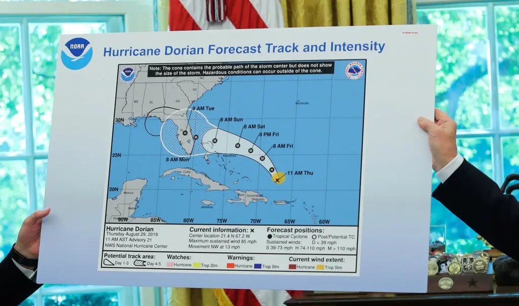 Source: New York Times article showing hand-drawn modifications to official NOAA weather map
The USDA released an announcement, USDA Invests Up To $1 Billion to Combat Avian Flu and Reduce Egg Prices, with two charts that made some questionable decisions worth discussing.
I don’t want to unfairly criticize whoever made these charts - I also have made some terrible charts in the past. We all have. And it is entirely possible that this task was given to some intern 15 minutes before the press release was issued.
But the FRED publishes high quality, ready to use versions for both of these charts. If all they wanted to do was show rising food and egg prices, they could have copy and pasted these charts directly.
But I cannot explain why else they would create their own versions except to be needlessly political and add in the shading for the presidential terms to try and blame Biden’s administration. Secretary Rollins is directly quoted in the press release saying as much. And I believe that these two charts make deliberate choices to be misleading and persuasive, rather than informative for the American public. So some criticism is deserved.
The design choices here could be taken straight out of the examples from How To Lie With Statistics. I considered remaking these charts to fix some of the errors, but as you’ll see - excellent versions of these charts already exist. The USDA actively chose to make worse versions.
Is it a style choice?
Here’s the first of the two charts:
 USDA chart showing increasing food costs with presidential term overlays
This was a bit tricky. It’s funny to me that the source is so prominent, but also vague. I’m not a frequent BLS data consumer, and I had trouble trying to use the BLS website to find the data. The almost equivalent BLS chart (under a section called Graphics for Economic News Releases), only shows data for the last 20 years, but at least it clarifies that the data is annual percentage change. The USDA chart doesn’t bother to include this information; I honestly don’t know if this should be taken for granted or not, but I don’t think that it is that hard to include a label either.
I also had no idea what “Food at Home” means, or what is included in that measure. The data visualization doesn’t give me the information I need to understand the chart; in a press release to the American public, I think that is a strange decision to not make a chart everyone can easily interpret.
The explicit decision to show the line in the foreground against the presidential terms in the background suggests a confusing relationship between who the President is and how food costs change. The two notes that stick out to me in this chart are the large spike during the Biden administration, and the decreases in prices during Obama’s terms.
If they wanted to create a “political” data visualization, labeling certain spikes and linking to relevant policy decisions would have been much more effective, rather than forcing the consumer ask the question of what causes which spike. The decision to use a rate from a price index, instead of just absolute costs of known items was interesting to me as well. I’m not quite sure who this visualization is meant for, nor what lesson I’m supposed to take from it. Is it “look how much prices spiked during the Biden administration”, or “look how the Biden administration stopped runaway cost increases after 2022?”
A couple minor points on the formatting as well:
Why not include President Bush’s terms? Notably, they also don’t include the start of the second Trump administration, even though the data was already available by the time this press release was issued (a month after Trump was inaugurated).
It is also amusing that they chose to leave gaps between each president’s shading - who doesn’t appreciate the few days each 4 years where we have no president and descend into lawlessness. Obviously no one can be held responsible for the price of food during these periods.
Why use tick intervals of 13 months in the x-axis? Funnily, this chart skips 2012 entirely.
Why not just move the x-axis labels down so the gridlines and primary rate line don’t all overlap?
A meaningful title and subtitle really do go a long way in helping a person read a chart.
I have nothing against making data visualizations in Excel. Some excellent visualizations can be made within Excel. But anyone who has ever made a chart in Excel knows that Excel’s Recommended Charts function will often make very odd decisions at the outset if the data is not in the correct shape. I am not sure if this is the result of that, or what.
I found this good alternative chart is published by the USDA:
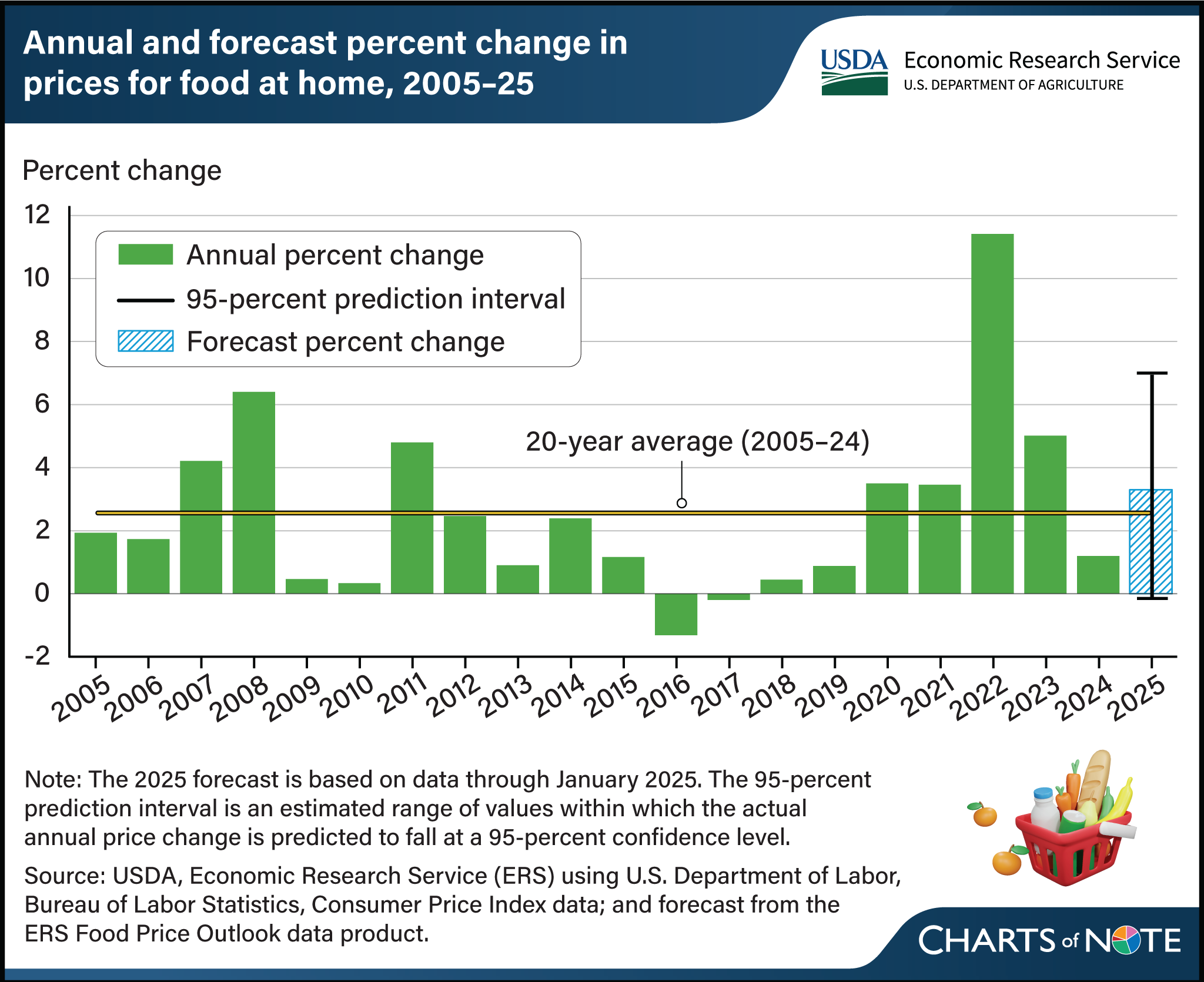
It uses the annual percentage change instead of the monthly rate, includes an average rate for comparison, clear labeling, and sources.
No, that’s not our fault
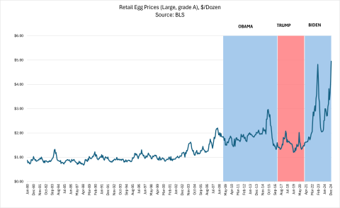
This is a more straightforward chart to include, which is good. The units are at least labeled on the y-axis.
But they clearly saw the first chart, thought - “no, 13 month intervals might be confusing - for this one, let’s go with 11 month intervals. But who cares, it will be so blurry no one can even read it!”, and shipped it. And this is minor, but the Obama, Trump, and Biden labels aren’t even aligned horizontally or vertically - it makes me think that these charts feel thrown together at the last minute.
Notably, the chart doesn’t bother to include Trump’s new term, which is politically convenient, given that the second spike the chart ends on is still going up.
I think this could be a great chart with appropriate labels showing why the price of retail eggs changes over time. I was actually surprised at the regular sharp spikes over time. But the decision to again highlight the presidents’ terms, rather than informative callouts, is a needlessly political choice that diminishes the chart’s value - plus, it actually detracts from any political message.
For example, the decision to show monthly changes in the price of eggs highlights the seemingly unpredictable ups and downs of the price within each presidents’ terms.
Strangely, Secretary Rollins is quoted in the press release saying “the Biden administration did little to address the repeated outbreaks and high egg prices that followed,” yet this chart clearly shows that egg prices severely fluctuating up and down during his term. Outside of this press release, they have the Press Secretary claiming that the Biden administration caused the shortage by trying to stop the outbreaks. So either he did too little, or his radical actions caused it all - but the Retail Egg Prices chart does not make any attempt to even help a reader understand.
This chart that goes out of its way to highlight which political party has control of the White House actually demonstrates that it probably isn’t the presidency that matters, but exogenous events not included in the chart (specifically, the seasonal impact of the avian flu).
I didn’t bother to remake this one, since a very nice chart from already exists, with excellent attribution and appropriate stylistic decisions. This is a very simple chart that does not attempt to pass a political message and just relates prices.
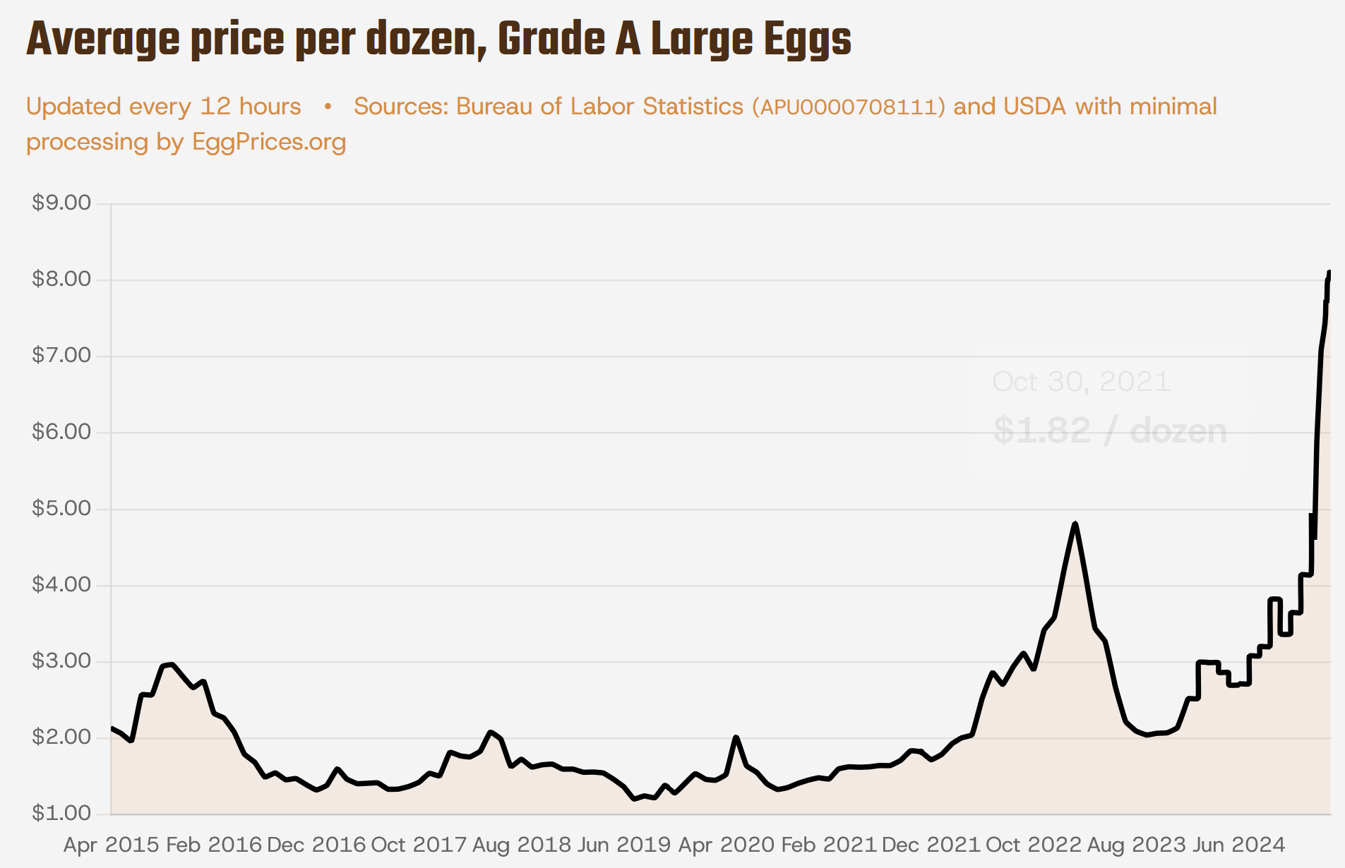
The data product is clearly indicated, you can hover over specific days for prices, consistent easy-to-read tick marks, and doesn’t filter data of specific dates out to exclude any increase under Trump’s administration. It is simply informative while conveying the urgency of the problem. And this would be a perfectly fine piece of context to give in the release.
There is also the FRED version. And the aforementioned BLS Graphics for Economic News Releases produces this chart.
What should they have done?
The memo is solely about egg prices. I would remove the Rate of Food At Home Cost Increase chart, since that is not only influenced by egg prices. It is off message.
Instead, they could have used retail egg prices chart in comparison to other food groups to show how egg prices have increased differently then other common grocery store items in the past few years.
Given my assumption that they had 15 minutes to make the entire thing, I started a timer and gave it a shot. The BLS News Release is the perfect place to start. The charts are made through Highcharts, which produces SVG, so these charts are easily editable in Dev Tools.
I started with the Average Price data (in U.S. dollars), selected items and made the following edits to the SVG:
- removed non-food items
- moved legend items over to 2 columns of equal length
- moved legend down to accommodate a subtitle, and put the starting title as the subtitle, then edited the title to a plain language story.
- brought egg prices line to the forefront of the chart
- edited the width to make the egg prices chart slightly thicker than the other lines, and decreased opacity of other food items
- added the event note directly on the resulting PNG.
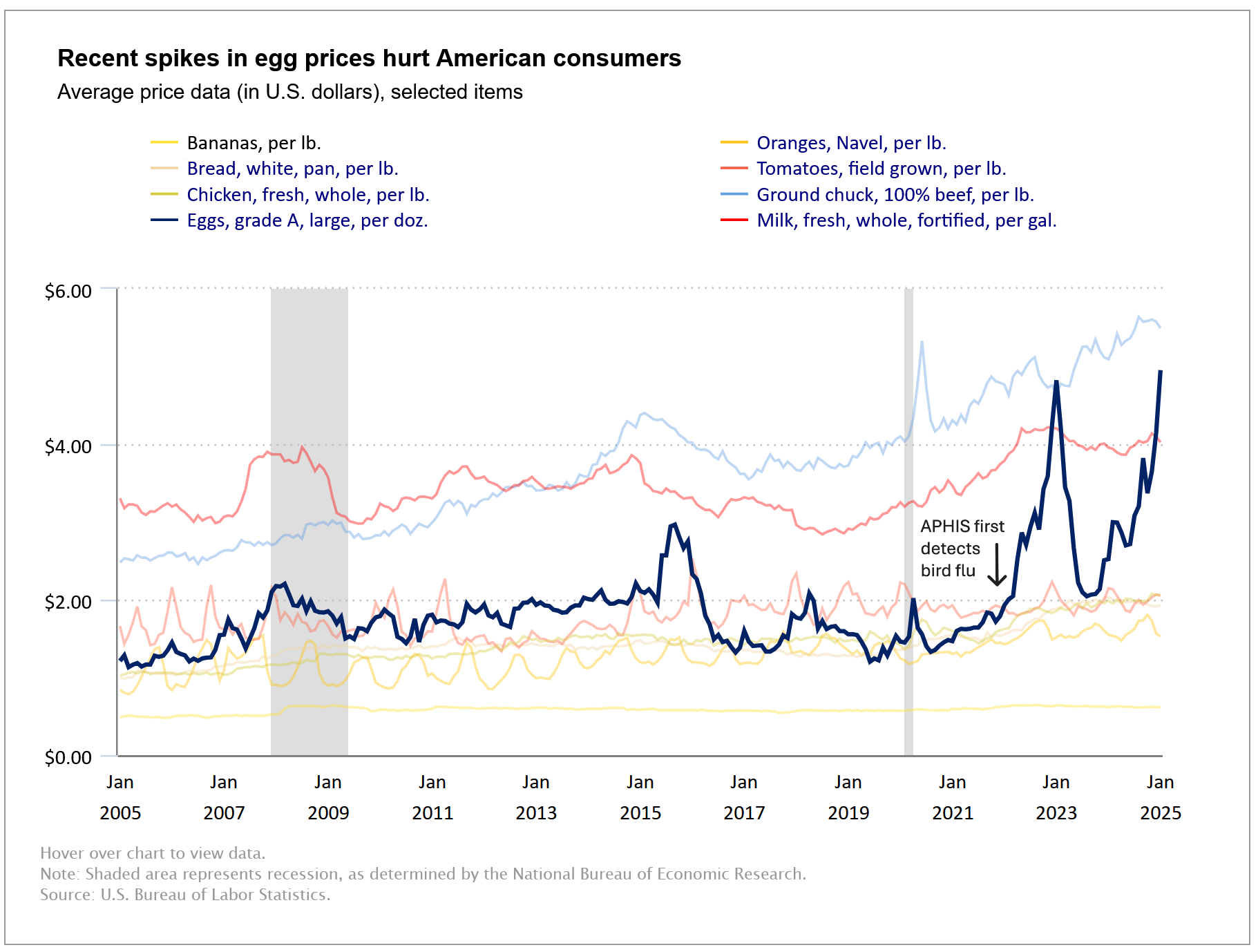
I even left it as a screenshot. No need to get fancy. These comparison groups really highlight how dramatic the changes in egg prices has been since 2021; at the same time, it is easy to interpret the costs.
With more time, I would embed the link into the chart note to the APHIS article, and add line labels for each category at the end of the chart (the colors overlap too much). Also, the text color for bananas category is black instead of blue, so would want to adjust that.
Overall
It appears very much so that the “new” plan is largely a continuation of the Biden administration’s plan. This makes sense - I don’t think any new administration would be able to immediately decrease the price of eggs.
But the people at the USDA are exactly the people who should be creating high quality data visualizations explaining the causes behind increases in egg prices, and the policy levers that we can use to make food more affordable. The charts in the USDA press release did not even attempt to accomplish this.
Are the charts that the USDA included in this press release really the best we can do? I don’t believe so, and hope for improvement as Secretary Rollins continues on in this role.
Follow-up (3/5/2025)
The Guardian posted a great data story, referencing this press release. Unsurprisingly they made their own visualizations, which are really well done. Read it here, on The Guardian.